Check midtones first
Faces, product fronts, walls, fabric, and screenshot panels usually show useful brightness changes earlier than pure white or black areas.
Watch pale areas
White backgrounds, paper, clouds, shirts, and light product packaging can become flat after a bright lift.
Keep contrast readable
Brightness can make a photo easier to see, but the image may lose shape if dark and light areas move too close together.
How to use it
Run brightness review in this order
Upload one image
Use the photo or screenshot that feels slightly too dark or too light. The tool keeps the original beside the edited preview.
- Good examples: dim screenshots, gray product photos, dull portraits, document scans, and pale UI captures.
- Use the cleanest source file you have if text, labels, or skin detail matters.
- A very compressed image can make fine texture harder to judge.
Move brightness in small steps
Brightness shifts values directly. Small moves are usually enough after the exposure direction already feels close.
- Try +5 to +15 for a photo that feels a little dark.
- Try -5 to -15 for a photo that feels too pale or washed out.
- Large moves can turn shadows gray or push pale areas toward flat white.
Drag the slider over useful areas
Compare the original and edited preview across the parts people actually read first.
- For screenshots, pass over text, icons, panels, and borders.
- For portraits, pass over skin, hair, eyes, and clothing.
- For products, pass over the label, surface, white packaging, and dark edge.
Read the brightness cards
Mean brightness, median brightness, and midtone shift help explain the size and direction of the change.
- Mean brightness can move a lot if the image has a large sky, wall, or white background.
- Median brightness is usually better for judging the main body of the image.
- Midtone shift is useful for faces, products, interiors, and screenshots.
Examples
Common brightness fixes
Screenshot text is too dim
The page is readable, but gray text and light borders feel too weak.
- Raise brightness a small amount.
- Drag the slider across text, icons, inputs, and panel edges.
- Stop if pale backgrounds start hiding borders.
Text should read more clearly, and the UI should still keep visible edges.
White product background looks gray
The product looks fine, but the background feels dull or dirty.
- Raise brightness slightly.
- Check the product label and the light background together.
- Use contrast later if the product loses shape.
The background should look cleaner, while product detail stays visible.
Portrait face needs a small lift
The face is close, but skin and eyes need a little more visibility.
- Raise brightness gently.
- Check skin texture, eyes, hair, and the lightest clothing.
- Reduce the move if skin starts looking flat.
The face should be easier to read, while skin still keeps natural texture.
Product photo looks washed out
The image is bright enough, but the product surface looks pale and weak.
- Lower brightness a small amount.
- Check the front face, shadow edge, and background.
- Add contrast later if the product still needs more shape.
The product should regain weight, and the background should stay clean.
Result checks
What to inspect after brightness changes
Midtones
Check faces, walls, product fronts, fabric, food, interface panels, and document paper.
Text and UI edges
Check small text, icons, input borders, separators, button labels, and chart lines.
Pale backgrounds
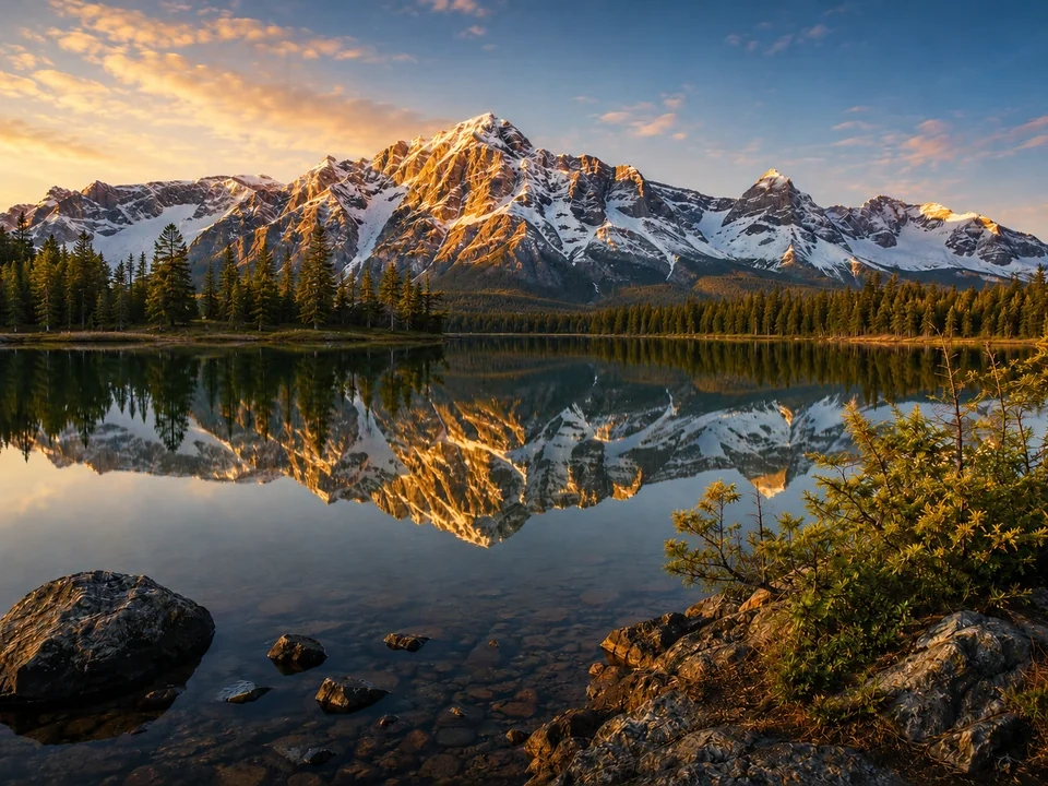
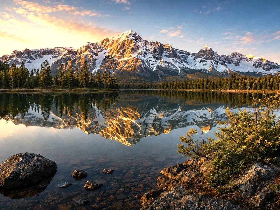
Check clouds, snow, paper, shirts, bright walls, and white packaging. In the reference image, the brighter side loses part of the cloud and snow highlight detail.
Dark areas
Check hair, black products, dark fabric, corners, screenshots in dark mode, and object edges.
Brightness effects
What brightness changes
Raise brightness
- Image values move lighter, especially visible midtones.
- Use it for slightly dark photos, screenshots, documents, or product images.
- Check pale backgrounds, skin, labels, and small text.
Lower brightness
- Image values move darker and can regain visual weight.
- Use it for washed-out photos, pale product shots, or over-bright screenshots.
- Check shadows, dark edges, faces, and product surfaces.
Mean brightness
- The average lightness across the measured image.
- Use it to see the whole-image direction of the change.
- Check the preview if a big sky, wall, or white area dominates the number.
Median brightness
- The middle brightness value in the image.
- Use it to read the main body of tones.
- Check subjects, walls, products, faces, and central content.
Midtone shift
- The practical movement around middle values.
- Use it for portraits, product fronts, interiors, and screenshots.
- Check flatness, text readability, skin texture, and product detail.
Exposure
- Light changes in a more camera-like way.
- Use it if the entire image feels underexposed or overexposed.
- Check highlights, shadows, and clipping after exposure moves.
Decisions
How to act on the brightness result
Keep the brighter version
Keep it if the subject, text, or labels are easier to see and bright areas still keep detail.
Image detail is lost
Reduce the brightness move if clouds, snow, pale areas, or dark shadows start losing visible detail.
Use another adjustment
Use exposure, contrast, levels, highlights, or shadows if only one part of the image needs fixing.
Common issues
What can make brightness review misleading
The image looks cleaner too quickly
A quick lift can feel better at first, but pale areas may already be losing texture.
White areas wash out
Paper, shirts, clouds, product packaging, and UI panels can lose subtle edges after brightness goes up.
Shadows turn gray
Dark hair, black fabric, night scenes, and dark product edges can lose depth after too much lift.
Color problems get hidden
A brighter image can distract from yellow skin, blue shadows, dull product color, or weak saturation.
Try it