Check shape first
Faces, products, clothing, and interface panels should gain clearer form, not a heavy or harsh look.
Protect dark detail
Hair, black products, dark fabric, and night corners can merge together after contrast goes too high.
Watch bright edges
White packaging, shiny metal, skies, and light UI panels can lose subtle edges after a strong contrast push.
How to use it
Run contrast review in this order
Upload one image
Use the image that needs this specific adjustment check. The tool keeps the original beside the edited preview.
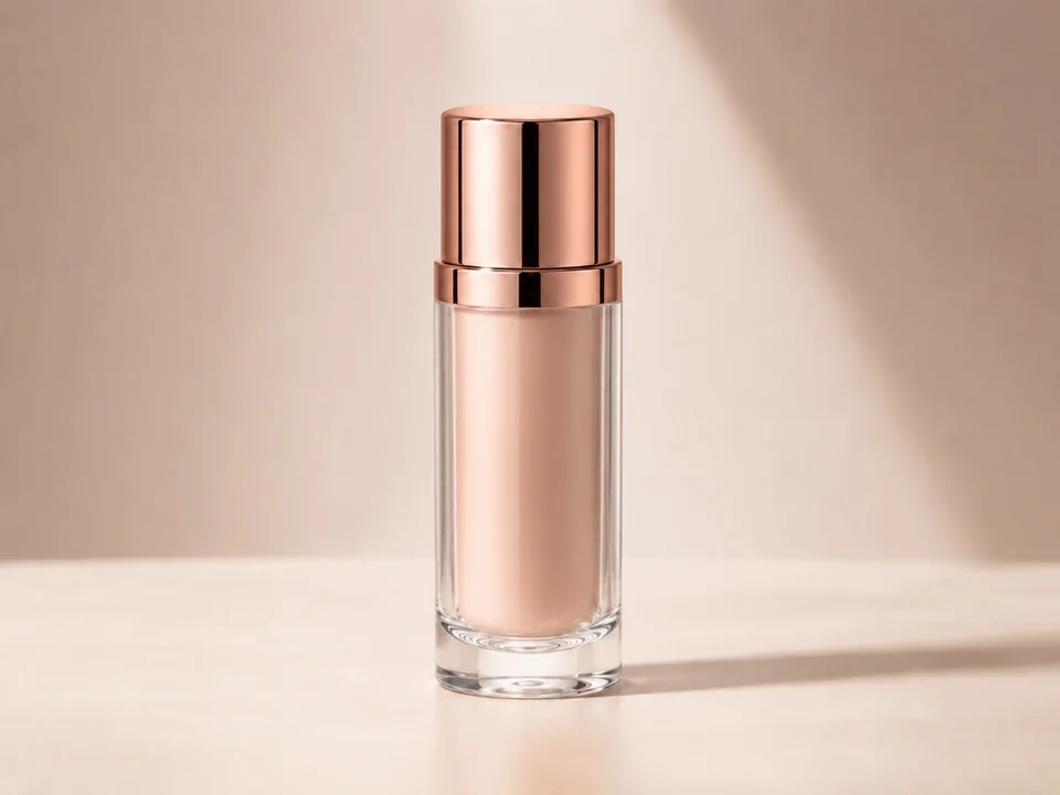
- Use a photo where the subject looks a little gray or weak, like the product example above.
- Keep the original size and crop so the slider compares the same areas.
- Use a clean source file if the label, surface texture, or product edge matters.
Move contrast in small steps
Start with a small increase or decrease. Stop as soon as the subject has clearer shape, then check shadows and bright areas.
- Raise contrast a little if the product blends into the background.
- Lower contrast if the shadow edge becomes too heavy.
- Stop before white highlights lose texture or dark edges merge together.
Use the slider on important areas
Drag across the parts people read first, then check the areas most likely to break.
- Drag across the product body to see whether the shape becomes clearer.
- Check the bright cap and reflective areas for lost highlight detail.
- Check the dark side and background edge for blocked-up shadows.
Read the result cards
The cards summarize the size and direction of the change. Look back at the preview to judge the visible result.
- Use the range card to confirm the contrast change is not too small.
- Use the clipping cards to catch lost bright or dark detail.
- Keep the edit only if the product looks clearer and still natural.
Examples
Common contrast fixes
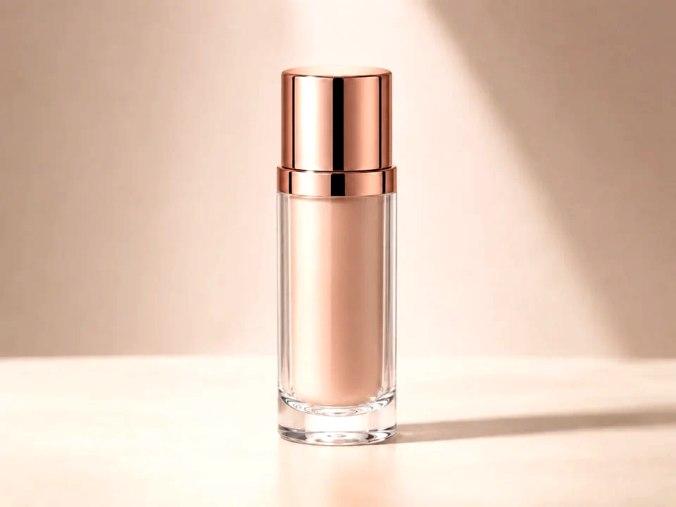
Product looks flat
The product is bright enough, but the surface has weak shape.
- Raise contrast a small amount.
- Check the label, front face, highlight, and dark edge.
- Stop if black edges lose separation.
The product should gain shape while label text stays readable.
Portrait looks too hard
Skin texture, hair, and clothing edges feel too sharp or heavy.
- Lower contrast slightly.
- Check eyes, skin, hair, and the brightest face areas.
- Use clarity later if only texture needs a softer touch.
The face should look calmer while eyes and hair still stay clear.
Screenshot text feels weak
The UI is readable, but text and dividers do not separate enough.
- Raise contrast gently.
- Pass the slider across small text and panel edges.
- Check pale panels for lost edge detail.
Text should feel clearer and the layout should still look natural.
Result checks
What to inspect after contrast changes
Subject shape
Check faces, products, food, fabric, buildings, and interface panels.
Dark areas
Check hair, black clothing, corners, dark labels, night scenes, and shadows.
Bright areas
Check skies, white backgrounds, lamps, paper, shiny edges, and pale UI surfaces.
Fine edges
Check small text, product labels, fabric seams, icons, and hair detail.
Contrast effects
What contrast changes
Raise contrast
- Dark tones move darker and bright tones move brighter.
- Use it for flat photos, dull products, and low-contrast screenshots.
- Check shadows, highlights, small text, and skin.
Lower contrast
- Dark and bright tones move closer together.
- Use it for harsh photos, hard shadows, and crunchy edits.
- Check faces, product edges, skies, and dark corners.
Clipping
- Tone detail can flatten at the black or white end.
- Use it as the warning signal for strong contrast moves.
- Check white areas, black areas, and the main subject.
Brightness
- Overall lightness changes more directly.
- Use it if the image needs a lightness change after contrast feels right.
- Check midtones, text, faces, and pale backgrounds.
Decisions
How to act on the contrast result
Shape is clearer
Keep the edit after the subject gains form and important detail remains visible.
Edges look harsh
Reduce contrast if skin, text, labels, or shadows start feeling too hard.
Light level is the real issue
Use exposure, brightness, or levels if the image mainly needs a lighter or darker tone.
Common issues
What can make contrast review misleading
The edit looks sharper at first
Higher contrast can mimic detail, but texture may only be getting harsher.
Shadows lose separation
Dark clothing, hair, corners, and black products can merge after a strong contrast push.
Highlights turn flat
White packaging, skies, and shiny surfaces can lose subtle texture.
Color feels stronger
Contrast can make color look more intense even if saturation did not move.
Try it