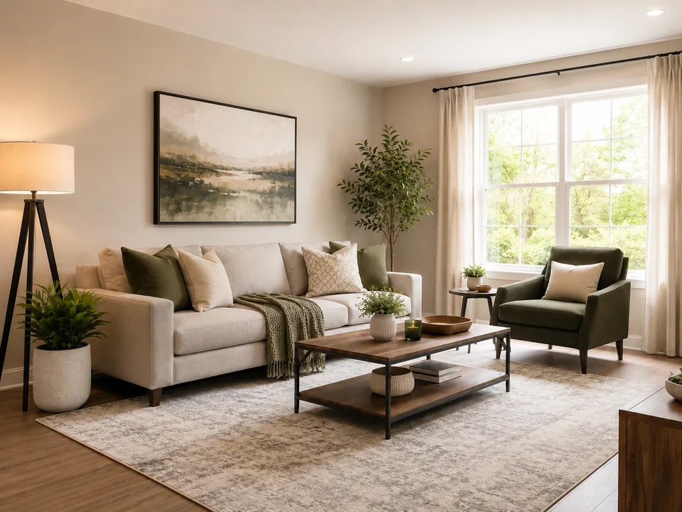
Keep the window detail
In the reference image, the bright window is the first place to check. If it turns plain white, the white point is too strong.
Make the sofa area clearer
Move the middle control a little. Watch the sofa, wall, and floor get easier to read while the window keeps detail.
Check the dark corners
Look at the chair, plant, table legs, and darker edges. If they merge into black, the black point needs to be softer.
How to use it
Run levels review in this order
Upload one image
Use the image that needs this specific adjustment check. The tool keeps the original beside the edited preview.
- Good examples: dim interiors, gray documents, faded scans, and photos where the main subject looks dull.
- Use a clean source file if window detail, dark corners, or paper texture matters.
- Heavy compression can make small clipped areas harder to see.
Adjust endpoints, then midtones
Set the darkest and brightest areas gently first. Then use the middle control to make the room feel clearer.
- Move the black point just enough for dark areas to keep shape.
- Move the white point just enough for pale areas to look clean.
- Use midtones for the sofa, walls, faces, documents, and other main areas.
Use the slider on important areas
Drag across the parts people read first, then check the areas most likely to break.
- Drag over the window first, then the chair and darker corners.
- Return to the sofa, wall, and floor to judge the middle brightness.
- For documents, check paper, text, stamps, and handwritten marks.
Read the result cards
The cards summarize the size and direction of the change. Look back at the preview to judge the visible result.
- Black and white point cards show how far the ends moved.
- Midtone cards show how much the middle of the image changed.
- Clipping cards warn you if bright or dark detail is disappearing.
Examples
Common levels fixes
Window gets too bright
In the reference image, the right side window can lose detail quickly.
- Lower the white point move.
- Check the curtain edge and outdoor highlight.
- Keep the room bright enough after reducing the white point.
The window should stay bright, but it should not turn into a plain white block.
Room still feels dim
The sofa, wall, rug, and plant need more light, but the window is already bright.
- Lift the midtones gently.
- Check the sofa, wall art, rug, and table area.
- Leave the white point alone if the window is close to clipping.
The room should look clearer while the window still keeps some detail.
Dark furniture loses shape
The chair, table legs, plant pot, and dark corners can become too heavy.
- Soften the black point.
- Check dark edges around the chair and table.
- Use contrast later if the room starts looking too flat.
Dark furniture should keep shape instead of merging into black.
Result checks
What to inspect after levels changes
Black point
Check dark corners, hair, fabric, product shadows, and black UI surfaces.
White point
Check paper, skies, snow, white packaging, lamps, and pale backgrounds.
Midtones
Check faces, walls, furniture, labels, screenshots, and document bodies.
Histogram shape
Check whether most pixels are being pushed into pure black or pure white.
Levels effects
What levels changes
Black point
- The darkest useful areas become deeper or start losing shape.
- Use it to make a flat image feel less gray.
- Check shadows, hair, black products, and dark text.
White point
- The brightest useful areas become cleaner or flatter.
- Use it for gray paper, dull whites, and faded backgrounds.
- Check white packaging, paper, skies, and lamps.
Midtone
- The middle brightness moves lighter or darker.
- Use it for faces, products, walls, and documents.
- Check the main subject and central content.
Clipping
- Endpoint detail can disappear.
- Use it as the warning signal after endpoint moves.
- Check both the metric and the preview.
Decisions
How to act on the levels result
Room looks clearer
Keep the edit if the sofa, walls, and darker corners look clearer, and the window still keeps detail.
Details start disappearing
Reduce the black or white point if shadows turn solid black or the window turns plain white.
The whole image is too dark
Use brightness or exposure for a simple lightness change across the full image.
Common issues
What can make levels review misleading
White areas lose small detail
Paper, curtains, clouds, and bright windows may look cleaner at first, then lose texture or thin lines.
Dark areas merge together
A stronger black point may make the image look sharper, then hide chair legs, hair, fabric, or corner detail.
The middle looks better, but the ends break
Faces, walls, and furniture may improve after a midtone lift. Check windows and shadows again before saving.
Old scans break faster
Faded ink, aged paper, stamps, and handwritten marks need smaller moves than a clean photo.
Try it