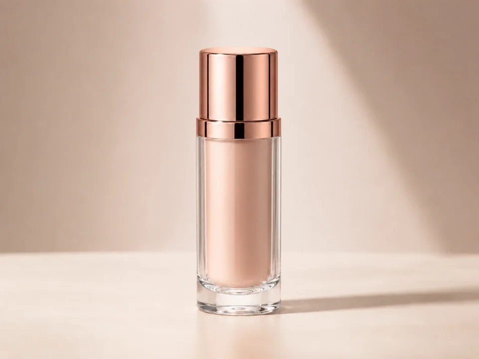
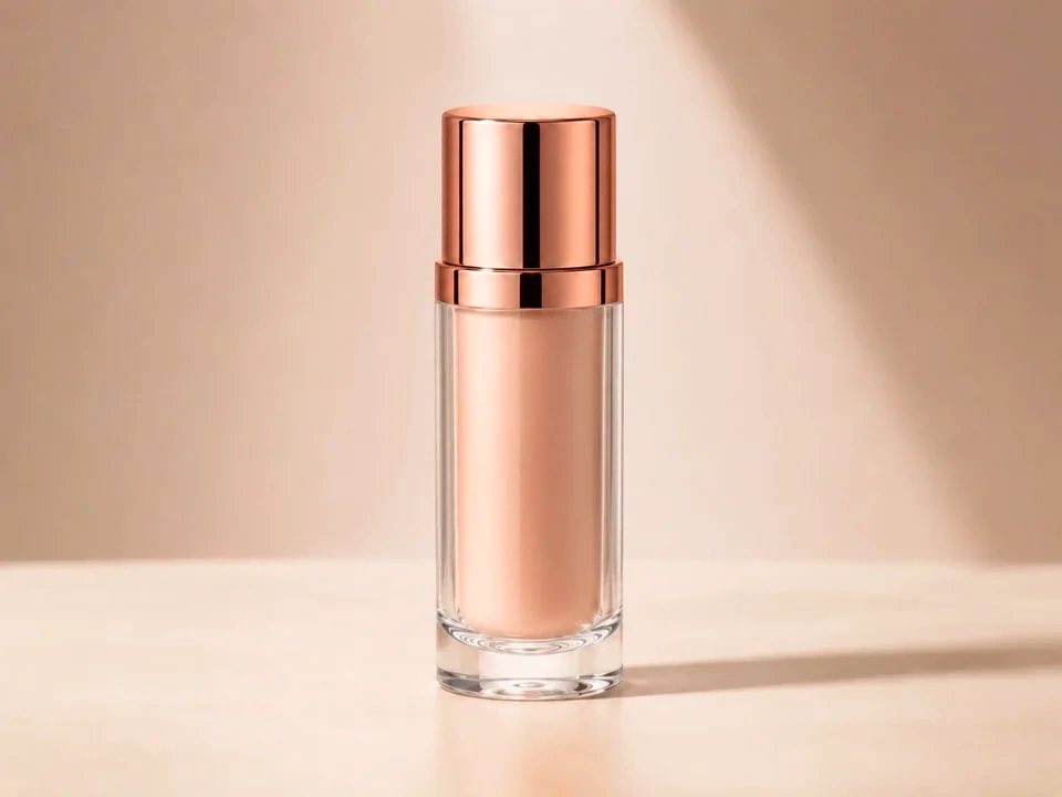
Check the lipstick first
Compare the shade inside the bottle before judging the whole photo. It should look richer, not orange or fake.
Look at the background
The beige background and soft shadow should stay calm. If they turn pink, the saturation move is too strong.
Watch the rose-gold cap
The cap can get red quickly. Keep the metal warm and shiny without making it look painted.
How to use it
Run saturation review in this order
Upload one image
Use the image that needs this specific adjustment check. The tool keeps the original beside the edited preview.
- Good examples: flat product photos, makeup shots, packaging, flowers, food photos, and brand assets.
- Use a clean source file if product color, skin, or brand color matters.
- A heavily compressed image can make color edges and flat backgrounds harder to judge.
Move saturation in small steps
Saturation changes color strength. Small moves make it easier to keep the edit natural.
- Use positive moves for flat product photos, makeup shots, packaging, flowers, food photos, and brand assets.
- Use smaller or negative moves for overcooked product photos, harsh reds, neon greens, and makeup colors that no longer match the item.
- After a large move, watch for lipstick that turns orange, a rose-gold cap that looks too red, glass edges with a color tint, or a beige background that turns pink.
Use the slider on important areas
Drag across the parts people read first, then check the areas most likely to break.
- Check the lipstick color, rose-gold cap, glass edge, beige background, label area, and soft shadow.
- Pass over the beige background, clear glass, label area, highlights, and soft shadow.
- Return to the main subject after checking the strongest colors.
Read the result cards
The cards summarize the size and direction of the change. Look back at the preview to judge the visible result.
- Color cards show the direction and strength of the color change.
- Product and background areas still need a visual check.
- Use the preview for the final call if the color starts looking artificial.
Examples
Common saturation fixes
Product color needs a check
The product looks close, but the color may drift from the original.
- Move saturation gently.
- Check the product surface, label, and background.
- Compare a neutral area before keeping the change.
The product should look clearer or more accurate while neutral areas stay believable.
Warm colors go too far
The color looks attractive at first, but reds, oranges, or pinks start taking over.
- Reduce the saturation move.
- Check lips, red packaging, warm shadows, and nearby neutral areas.
- Use white balance later if the color cast remains.
Warm colors should look rich, not painted or dull.
Brand colors need consistency
A logo, package, or interface color must stay recognizable.
- Check the brand color first.
- Move saturation in smaller steps.
- Compare the brand area with white, gray, and black areas.
Brand color should stay recognizable and surrounding neutrals should stay clean.
Result checks
What to inspect after saturation changes
Main subject
Check the lipstick color, rose-gold cap, glass edge, beige background, label area, and soft shadow.
Products and brands
Check packaging, labels, logos, fabric, paint, and product surfaces.
Natural colors
Check skies, grass, flowers, food, wood, water, and outdoor shadows.
Neutral colors
Check paper, walls, white objects, gray objects, black objects, and UI backgrounds.
Saturation effects
What saturation changes
Raise saturation
- color strength moves stronger or more visible.
- Use it for flat product photos, makeup shots, packaging, flowers, food photos, and brand assets.
- Check the lipstick color, rose-gold cap, glass edge, beige background, label area, and soft shadow.
Lower saturation
- color strength becomes quieter or closer to neutral.
- Use it for overcooked product photos, harsh reds, neon greens, and makeup colors that no longer match the item.
- Check skin, neutrals, and brand colors.
Neutral check
- White, gray, and black areas reveal color cast quickly.
- Use it after each color move.
- Check paper, walls, shadows, and product backgrounds.
Saturation
- Color strength can change the perceived result.
- Use it after color direction feels right.
- Check strong reds, greens, blues, and skin.
Decisions
How to act on the saturation result
Color looks believable
Keep the edit after the main subject improves and important colors still look credible.
Color feels forced
Reduce the move if you see lipstick that turns orange, a rose-gold cap that looks too red, glass edges with a color tint, or a beige background that turns pink.
The whole image has a color cast
Use white balance if whites or gray areas are already leaning yellow, blue, green, or magenta.
Common issues
What can make saturation review misleading
Lipstick shade gets too strong
A richer preview can look good at first. Check that the lipstick still matches the product and does not turn orange.
The background turns pink
The beige backdrop should stay soft. If it starts looking rosy, reduce the saturation move.
Glass edges pick up color
Clear glass should not turn orange or pink along the edge of the bottle.
Screens can change the result
A makeup shade may look different on a laptop, phone, or external monitor.
Try it