Start with the window greens
The plants and outdoor greenery should look fresher, not neon.
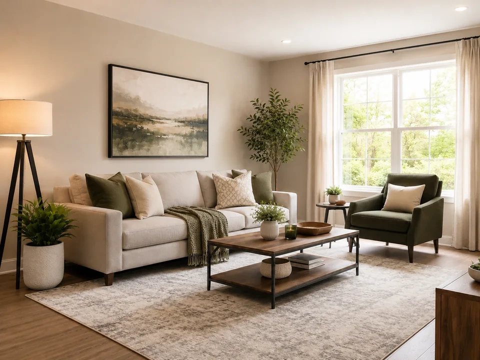
Check the sofa and rug
Fabric and soft beige areas should stay calm after the color lift.
Check the wood table
The coffee table and wood tray should stay warm, not rusty orange.
How to use it
Run vibrance review in this order
Upload one image
Use the image that needs this specific adjustment check. The tool keeps the original beside the edited preview.
- Good examples: dull interiors, travel photos, garden views, room photos, and flat outdoor images.
- Use a clean source file if fabric color, plants, wood, or window areas matter.
- Use the original photo or a clean export if you have it. Reposted screenshots can make color harder to judge.
Move vibrance in small steps
Vibrance is useful when a photo feels a little dull. Small moves help the room look fresher without making the greens or wood too loud.
- Raise vibrance a little if the room looks washed out.
- Use a smaller move if greens or warm wood start looking loud.
- Lower vibrance if the original already has strong color.
Use the slider on important areas
Drag across the parts people read first, then check the areas most likely to break.
- Drag over the window greenery first.
- Move across the sofa, rug, and curtains.
- Check the coffee table, wood tray, and wall art before keeping the edit.
Read the result cards
The cards summarize the size and direction of the change. Look back at the preview to judge the visible result.
- If a card shows a big change, go back to the image.
- Look back at the window greens, sofa, rug, and wood table.
- Keep the edit only if the room still looks natural.
Examples
Common vibrance fixes
Room looks washed out
The sofa, rug, plants, and wall art look a little dull.
- Raise vibrance in a small step.
- Check the greenery outside the window.
- Look back at the sofa, curtains, and rug.
The room should feel fresher without changing the whole color of the space.
Greens get too loud
The plants and outdoor greenery can become the first thing you notice.
- Reduce the vibrance move.
- Check the plant leaves and the bright window area.
- Compare the greens against the beige wall and sofa.
Green areas should look alive, not neon.
Warm wood turns orange
The coffee table, wood tray, and warm window light can get too saturated.
- Use a smaller move.
- Check the coffee table, wood tray, and warm window light.
- Keep the fabric and wall colors calm.
Wood should stay warm, not orange.
Result checks
What to inspect after vibrance changes
Window greenery
Check the plants and outdoor greens near the bright window.
Soft fabrics
Check the sofa, pillows, rug, curtains, and pale walls.
Warm wood
Check the coffee table, wood tray, and warm highlights near the window.
Bright window
In this example, check the trees outside the window. If the leaves turn into a bright green blur, reduce vibrance.
Vibrance effects
What vibrance changes
Raise vibrance
- Muted colors become more visible.
- Use it when a room or outdoor photo looks flat.
- Check plants, fabric, walls, and wood.
Lower vibrance
- Strong colors calm down.
- Use it when greens, reds, or warm indoor colors feel too loud.
- Check plants, wood, and bright areas.
Strong colors
- Already colorful areas can still move too far.
- Use them as warning spots.
- Check window greens and warm wood.
Neutral areas
- Light walls and curtains can show unwanted color.
- Use them after each move.
- Check curtains, beige walls, sofa fabric, and rug.
Decisions
How to act on the vibrance result
Room feels fresher
Keep the edit if the greenery looks fresher and the sofa, rug, and curtains still look natural.
Greens or wood get loud
Reduce the move if plants look neon or the wood table turns orange.
The whole image has a cast
Use white balance if walls, curtains, or shadows lean yellow, blue, green, or magenta.
Common issues
What can make vibrance review misleading
Greens go neon
Plants and outdoor greenery can become too bright after a strong vibrance lift.
Wood turns orange
The coffee table and wood tray can pick up too much color.
Pale fabric changes
Sofa fabric, curtains, and rugs should not start looking tinted.
Window areas distract
Bright window areas can pull attention if the color lift gets too strong.
Try it