Look at the main subject
For a product photo, check the label and surface. For a portrait, check skin and eyes. For a screenshot, check text and borders.
Move one control at a time
Change exposure, brightness, contrast, or saturation first. Compare the result, then add temperature or tint only after the light looks right.
Check the damage areas
White areas, dark corners, skin, skies, product labels, and small text usually show problems before the rest of the image.
How to use it
Run the comparison in this order
Upload one image
Choose the photo or screenshot you want to adjust. The tool creates the original view and the edited preview from the same file.
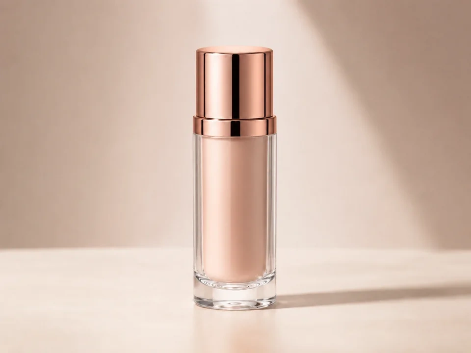
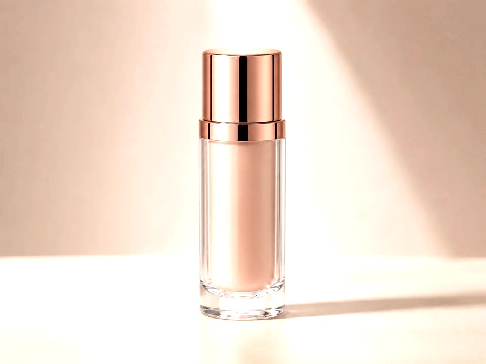
- Good examples: product photos, portraits, interior photos, screenshots, and social images.
- Use a clean source file if you plan to judge color or clipping.
- Very small or heavily compressed files can make detail changes harder to judge.
Set the main adjustment
Start with one visible change. Exposure changes the whole light level. Brightness lifts or lowers visible values. Contrast changes depth. Saturation changes color strength.
- Product photo too dim: start with exposure or brightness.
- Flat image: add a little contrast before adding saturation.
- Photo looks yellow or blue: use temperature after the brightness feels right.
Choose the comparison view
Use the slider for quick before-and-after review. Use side-by-side view for scanning detail across the full image.
- Slider view is useful for faces, labels, product edges, and layout screenshots.
- Side-by-side view is useful for overall color and brightness judgment.
- Keep the same zoom while judging a small change.
Read the summary cards
The cards give a quick check for overall brightness, contrast range, color intensity, and clipping risk.
- Brightness tells you whether the edit is moving lighter or darker.
- Contrast range tells you whether the image is gaining depth or becoming flat.
- Clipping risk warns you about lost shadow or highlight detail.
Move to a focused page
Use the general page for a broad pass. Use a focused page for deeper review of one control.
- Exposure page: overall light and highlight risk.
- Contrast page: depth, separation, and harsh edges.
- Saturation page: color strength, skin, product color, and brand color.
Examples
Four common adjustment workflows
Product photo looks too dark
The item is visible, but the label, material, or front face feels dull.
- Raise exposure a little.
- Check the label and shiny areas with the slider.
- Add a small amount of contrast only after the product shape still looks clean.
Stop once the product is clear and white areas still have detail.
White background looks gray
The image should feel clean, but the background looks muddy.
- Lift brightness slightly.
- Use the clipping card before pushing more.
- Use temperature or tint if the white background looks yellow, blue, green, or magenta.
The background should look cleaner, while the subject should still keep edge detail.
Portrait color feels unnatural
The face is bright enough, but skin looks too orange, red, green, or gray.
- Leave saturation alone at first.
- Adjust temperature for warm or cool cast.
- Use tint for green or magenta cast, then return to saturation for a small final move.
Skin should look believable, and eyes, hair, and shadows should not look tinted.
Screenshot text is hard to read
The image is a UI screenshot or document capture, and small text feels weak.
- Increase contrast slightly.
- Use the slider on text edges and button borders.
- Reduce brightness if light backgrounds start washing out text.
Text should become easier to read, while thin borders and icons should stay clean.
Result checks
What to inspect after each edit
Subject detail
Check the main subject first. A photo can look brighter overall but lose skin texture, product label detail, or shadow shape.
Bright areas
Look at windows, skies, white products, and reflective spots. These areas show highlight clipping quickly.
Dark areas
Check hair, fabric, corners, and deep shadows. Contrast and exposure can make these areas too heavy.
Neutral colors
Gray walls, white paper, black objects, and UI backgrounds reveal temperature or tint problems fast.
Adjustment effects
What each adjustment changes
Exposure
- The whole light level.
- Use it for a photo that feels too dark or too bright overall.
- Check windows, white products, skies, and bright skin areas.
Brightness
- Visible values, especially midtones.
- Use it for a small lift or drop after the main light level feels close.
- Check text, pale backgrounds, faces, and product labels.
Contrast
- The distance between dark and bright areas.
- Use it to add shape to a flat image or soften a harsh one.
- Check shadows, edges, hair, fabric, UI borders, and faces.
Levels
- Black point, white point, and midtone balance.
- Use it to set stronger blacks, cleaner whites, or better midtone weight.
- Check the clipping map, histogram, white objects, and dark corners.
Saturation
- Color strength.
- Use it to make color softer, cleaner, or more vivid.
- Check skin, food, product color, brand color, and red or blue areas.
Vibrance
- Weaker colors more than already-strong colors.
- Use it for a safer color lift than saturation on portraits or mixed scenes.
- Check skin, neutral backgrounds, and any color that was already bright.
Temperature
- Warm or cool color cast.
- Use it for photos that look too yellow, orange, blue, or cold.
- Check white paper, gray walls, skin, snow, and product backgrounds.
Tint
- Green or magenta color cast.
- Use it for fluorescent green casts, pink casts, or mixed indoor lighting.
- Check neutral walls, white packaging, faces, and shadows.
Highlights / Shadows
- Bright and dark areas separately.
- Use it to recover a bright sky, lift dark hair, or open shadow detail.
- Check halos around edges, noisy shadows, and flat highlight areas.
Sharpness
- Edge crispness and fine detail.
- Use it for slightly soft photos, product labels, or screenshots.
- Check hair, small text, fabric, labels, and haloing around hard edges.
Clarity
- Midtone texture and local contrast.
- Use it for more texture in products, landscapes, buildings, or fabric.
- Check skin, skies, smooth backgrounds, and product edges.
Noise Reduction
- Grain, speckles, and fine texture.
- Use it for high-ISO photos, dark images, or compressed-looking backgrounds.
- Check hair, text, fabric, and small product detail.
Dehaze
- Haze, low contrast, and deep color density.
- Use it for foggy scenes, washed-out landscapes, or dull outdoor photos.
- Check skies, dark areas, and color that starts looking too heavy.
Vignette
- Corner and edge brightness.
- Use it to guide attention toward the center or correct dark lens corners.
- Check product backgrounds, faces near the edge, and corner detail.
Film Grain
- Visible texture across the image.
- Use it for a stylized photo look or to soften overly clean digital edits.
- Check skin, flat backgrounds, and small text.
Hue
- The direction of colors around the color wheel.
- Use it for creative color shifts or fixing a specific color family.
- Check brand colors, skin, neutral surfaces, and product accuracy.
Decisions
How to act on the comparison
The subject still looks natural
Keep the edit after the subject is clearer, detail remains visible, and the color still feels believable.
One area looks too strong
Reduce the active control after faces, white areas, dark corners, or brand colors start looking pushed.
One control needs closer review
Open the matching focused page for exposure, brightness, contrast, levels, or saturation.
Common issues
What can make the comparison misleading
The preview is judged too quickly
A stronger edit can look better at first glance. Check faces, text, product edges, shadows, and highlights.
The image is already compressed
Compression texture can make sharpness, contrast, and noise look worse during adjustment review.
Only the center is checked
Edges and corners often reveal clipping, vignetting, color cast, and lost shadow detail.
Color is judged on one object
Use neutral surfaces and the main subject together. A white wall and a face can tell different parts of the story.
Try it